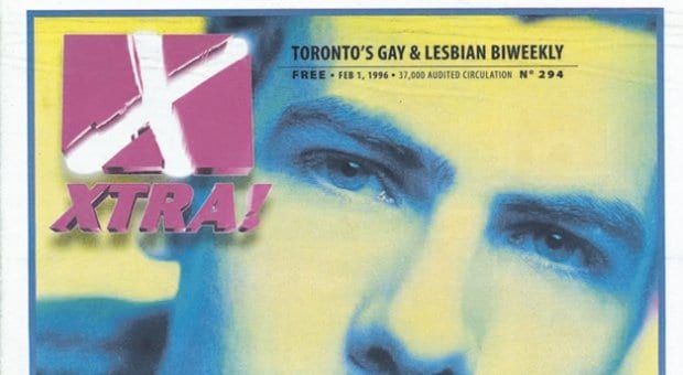
The redesigned Toronto cover of Xtra. Credit: Cover photo by N Maxwell Lander.
It’s my pleasure to introduce a new and improved Xtra. If you’re reading this in print, you’ll have noticed already the biggest transformation — a new size, the first change in the paper’s dimensions since 1996.
I was employed at the Toronto office of Pink Triangle Press as senior designer in 1996, and I remember what a big deal the change was. Our old format was a tabloid that was folded to magazine size, and our transformation to an unfolded tabloid allowed us a much larger cover area. We graced it with an emerging queer musician named Ashley MacIsaac.
That change in size hit a nostalgic nerve for me, because it was a departure from the format of the first Xtra I ever picked up, at my very first gay bar, in London, Ontario. I took that issue home and read it from front to back. The cover featured the Communards, whose music was required listening for any sexually curious, questioning teenager.
The fact that I can remember these covers so vividly is a testament to the power of print and one of the reasons I feel predictions of its death are greatly exaggerated. Granted, we will never return to print’s glory days before the rise of the internet, the pre-recession years when advertisers were aplenty and our Pride issues in Toronto were more than 100 pages. But there is mounting evidence that print still fulfills an essential, if diminished, role in our shifting media landscape. We can’t predict what lies ahead, but what we do know is that, overwhelmed by the abundance of information on the web, there is a growing demand for curated content — a feature that printed publications have always offered, by their very nature.
I read my first issue of Xtra from front to back because it had a front and a back. It was an assembled package, a snapshot of what was happening in our communities on Jan 3, 1987. Print still has a weight and a permanence that is unmatched by digital media — 25 years from now, the edition you hold will be a record of our own changing times. (In addition to being stored in the PTP archives, all issues are added to the Canadian Lesbian and Gay Archives and uploaded to EBSCO Publishing, a scholarly research database.)
As our digital devices become less of a novelty, there is a renewed appreciation for the tactile sensation of turning a page. We are now seeing a renaissance in the areas that print does best — telling stories through the use of large-scale photos, infographics and thoughtful page layout unhindered by screen size, system fonts and browser compatibility. Any publication that is to survive in this age must employ these graphic devices with skill and sophistication.
On that note, we give you a streamlined, compact design that works efficiently in a smaller space while maintaining both legibility and style. We’ve enlisted a new font for our headlines, Tungsten, described by its makers as “a compact and sporty sans serif that’s disarming instead of pushy.” And with the reduction in page size, we now have full colour available on all pages, allowing us to use our palette and visuals more effectively to complement the content provided by our diligent editors.
Transformation is not possible without teamwork. The size change demanded a complete restructuring of our ad sizes, requiring our sales and accounting staff to update advertising rates, reconfigure databases, notify clients and resize ads. The editorial and design team have worked hard to ensure our pages are both engaging and attractive.
At Pink Triangle Press, these changes are just part of many exciting developments that will ensure we can deliver the stories relevant to you. We hope you’ll like our front, our back and everything in between.

 Why you can trust Xtra


