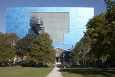
Between the crayon box on coloured toothpicks and the cascade of swirling glass and wood with the odd corkscrew rising into the air, the intersection of Dundas and McCaul is probably the most (and fastest) changed two blocks in downtown Toronto. I speak, of course, of Will Alsop’s 2004 extension to and redesign of the Ontario College of Art and Design (OCAD) and Frank Gehry’s hot-off-the-presses renovation to the Art Gallery of Ontario (AGO). Cuddled up next to each other, these two institutions always defined that neighbourhood. Now that the AGO has been unveiled though, it seems to be a pretty neat encapsulation of the kind of development fever that has gripped Toronto over the last few years.
There was a great deal of apprehension about the AGO’s redesign, especially after the divisive nature of the Royal Ontario Museum’s facelift. People were pretty leery of these institutional rebrandings, cynical not only of their necessity but also of the ability of the institution to actually carry it off. Would the new building stand up to all the hoopla? Would the new building still be standing after the hoopla? A lot of this reaction can be chalked up to a profoundly Canadian brand of self-effacement. We’re not really that comfortable with big public spectacle; we might front like we’re a big international city, but our arts scene secretly believes we’re a cultural back-water. So when an architectural superstar like Gehry wades in, the gossip born of insecure self-nagging pours forth: It won’t work; there are big problems; the AGO can’t afford the restructuring; it’ll end up a big public mess and, really, whatever he does will just be really minor anyway.
Normally I’m a pretty cynical fellow myself. But I have to say Gehry and the AGO pulled it all off. It’s not an epochal architectural statement. Nor is it a pinnacle in Gehry’s career (like the Bilbao Guggenheim). But more importantly it’s also not sloppy, poorly executed, purely superficial nor safe in any way. It’s a beautifully executed rethinking and reorganization of a major Canadian museum that deserves a higher profile.
“Our new gallery is 242 percent larger than the old one,” says assistant curator of photography (and former Xtra art reviewer) Sophie Hackett. “Photography certainly needed more space to exhibit the permanent collection, which has now grown to more than 40,000 works. Contemporary art needed more space too. The prior incarnation of the AGO could never have shown off this rich range of works to their best advantage.”
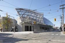
Gehry’s work is not just minor tweaking. The renovation has completely altered the block-long façade that faces Dundas St. “The building communicates beautifully with the street, the park, the neighbourhood,” says Hackett. “Gehry created a sense of openness, community, generosity.”
Inside the museum he has sparked a major reorganization of the permanent collection. “The process of reimagining the building went hand-in-hand with reimagining how to present our permanent collection. We all sought, as curators, to create connections for visitors today.”
The permanent collection used to be more or less on two floors with viewers following a chronological arrangement of eras: medieval to 19th-century snaked along the winding galleries of the first floor, and turn of-the-century to contemporary work were laid across the galleries along the second floor. Now the collection is organized historically from the bottom up. Older work takes over the first two floors, giving the art (and the viewer) much more room to breathe, and 20th-century and contemporary art now occupies the new galleries on the fourth and fifth floors.
Speaking of breathing room Gehry has literally opened up the galleries: The ones on the north side of the first and second floors have had their roofs raised with recessed skylights so that daylight falls softly and evenly into the galleries, simultaneously brightening the rooms and softening the quality of the artificial spot lighting. “I think it’s fabulous,” says Hackett, “with all the natural light and improved flow among the galleries and many spaces that are both intimate and grandiose. They are spaces that I really want to spend time in. I like the exterior flourishes but I think the interior spaces are the best part of what Gehry did.”
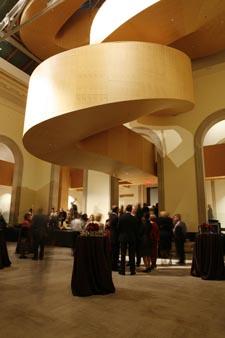
In typical Gehry fashion, there’s also a great deal of spectacle. For starters, the undulating glass surface of the façade gives a majestic sweep to Dundas (and spectacularly evokes the streetcars jetting back and forth). The entire entryway has been redone, with a massive serpentine ramp (one of Gehry’s signatures, and one of the main motifs of the building) leading you into the museum. Walker Court has also been pretty much razed and in the process made much more accessible. Gone is the stifling neoclassicism and dark wood panelling. Gehry has brightened it up, adding a pale wooden walkway that runs the upper circumference of the room. This walkway culminates in a massive wooden staircase, shaped like a tight corkscrew, that leads you up, momentarily outside and above the roof, into the contemporary galleries. There is a similar staircase at the south end of the building, spiralling from the sculpture garden all the way up to the fourth and fifth floors.
The views are amazing. From the north, the front half of the AGO sits below you and the city sprawls out in front of you. To the south, you can see OCAD’s Sharp Centre for Design hovering in the distance and University Ave stretching all the way down to the CN Tower and the lakeshore.
***
And the art? There are some spectacular new acquisitions and installations on display, much of it queer: David Altmejd’s entry for the 2007 Venice Biennale, two giant chicken men strolling amid a mall of mirrors and crystals and fur, leads you into the sculpture garden (at night time, when the mirrors of Altmejd’s sculpture and the AGO’s rear glass wall play reflection games with each other, the effect is magical). Luis Jacob’s beautifully tactile communally made ballpoint-pen drawings are (temporarily) installed in the new contemporary art Swing Space on the west side of the first floor.
Much of the new work is showcased in the new contemporary galleries. There is a General Idea room, covered floor to ceiling with their infamous AIDS logo wallpaper, and a gorgeous Stephen Andrews piece, one of his pixellated portraits.
There is more queer-themed programming and events coming up: the Youth Line art auction benefit, curated this year by Sharon Switzer, is being hosted at the AGO in December. An exhibition of work by that arch-dandy of the Pre-Raphaelites, William Holman Hunt, is slated for early February.
The new AGO is not perfect. The contemporary galleries seem overly congested and too busy, something that’s not helped by smaller rooms nestled in the larger galleries. The southern galleries on the first and second floors seem mostly untouched, dim and cramped compared with the expanded brightness of their northern neighbours.
But neither Gehry nor the AGO can expect to satisfy all of the people all of the time. Instead, they have delivered something much more praiseworthy: a genuinely exciting new building, not only worthy of all the hoopla, but solid and subtle enough to still be standing and still be an object of fascination and affection when it’s no longer the “new AGO,” and just simply the AGO.


 Why you can trust Xtra


