The 519 Church Street Community Centre is chopping its name and going for a new look.
On Thursday, May 14, the organization launched a new logo and a new, shortened name — The 519. It has also launched a more user-friendly and mobile-friendly website that will provide up-to-date information on programming by both The 519 and other community organizations.
“This is important, because we’ve seen that the vast majority of our users are coming through mobile,” says Matthew Cutler, director of strategic planning initiatives for The 519. “A lot of folks — particularly marginalized people — have internet only on their cell phones.”
Shortening its name is a reflection that much of the centre’s work goes beyond the confines of its address. “It became clear that [our name] limited how people understood us,” Cutler says. “Often our training and education programs don’t happen in this building. We’re no longer just a community centre.”
Giving the organization a less site-specific name makes it more organic for them to take events across the city — and even to apply the name to other buildings. If the proposed LGBT sports and recreation facility in Moss Park is approved, the new building will be called The 519 Recreation Centre.
The 519 also introduced a motto: space for change. It indicates there’s still work to be done on LGBT issues and that the organization endeavors to make both literal and figurative room (figurative in the sense of getting conversations going across the city) where people can work toward that progress.
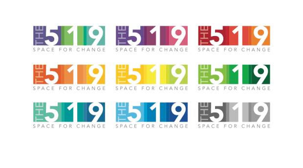
In the revised logo, the three colour blocks in each logo are meant to reflect The 519’s three guiding principles: service, space and leadership.
Sometimes all nine logos will be used simultaneously — the all-but-obligatory rainbow reference. However, various segments of the community have their own symbols and colours. “You can’t be an LGBT organization without having some reference to the rainbow,” Cutler says. “But for many folks the rainbow doesn’t speak to them. I know certainly trans communities — their colour set is different.”
Cutler says that with the new logo scheme there is flexibility to use only a few of the logos at once if their combined colours better represent the segment of the community being addressed by a given program. “We tried to keep the vibrancy and symbolism of the rainbow while giving ourselves a bit more flexibility to use the logo in different ways.”

 Why you can trust Xtra