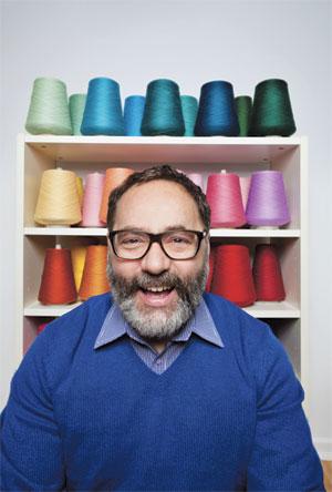
On the afternoon of Sept 19, 1970, Owen Stewart, the three-year-old brother of gay Ottawa textile artist Carl Stewart, was hit by a car and killed as Carl watched.
As a result, Stewart never had a chance to know his brother, but Carl says Owen always hovered as a presence in the family home. Gradually, though, Owen’s presence in Stewart’s life faded.
“Quite literally, years went by when I don’t think I ever thought of him. Then, in 2002, my mother died,” Stewart says. “When something like that happens, lots of dust gets tossed into the air. I started to think about him, and him in relation to my mother. He just sort of became present in my memory and in my life again.”
As a belated 40th birthday present to Owen, Carl has created a new body of work about him, which is showing in the first- and second-floor lobbies of Centrepointe Theatre until Feb 15.
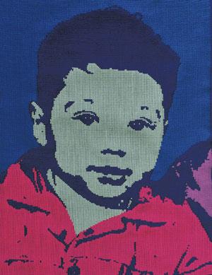
Appropriately, the collection is called belated. It’s made up of two elements: 10 wildly colourful Warhol-inspired hand-woven portraits that, together, are called Icon, and a series of 11 linked cross-stitch portraits called Memoria.
What ties the two halves of the project together is that every portrait is created from the same image: the only remaining picture of Owen — a photo that is now iconic to the Stewart family.
“The year he died, my mother included that photograph in every Christmas card she sent. To all of the relatives and friends and that sort of thing,” Stewart says. “This was the image that was trimmed in tinsel and hung on the Christmas tree — the angel was at the top, and then him. There’s a set of bronzed baby booties with an 8×10 [of the photo], and my parents always held that picture in snapshots. Anytime someone got a new camera, they’d say, ‘Okay, get together on the couch, and I’ll take your picture.’ My mother would always grab this photo, and it would sit between her and my father.”
It was this arm’s-length, pictorial presence that gave Stewart the idea to give Owen’s image the Warhol treatment and call on the celebrity, glamour and distance Warhol evoked in his paintings. The specific reference to Warhol’s iconic and much-loved portraits of Mao shines through in Stewart’s compositions, as does the childlike playfulness of the colour scheme. Despite the sombre story behind this collection, there’s a sprightly beauty to the work.
“The style of image is very familiar. I think people will look at it and go, ‘Well, that’s Warhol.’ That, I think, is good. For me, it does create a sense of familiarity — even though you don’t know who this person is,” Stewart says.
The style of the paintings lends an iconic stature to the image of Stewart’s brother: like a beloved child leader, or a religious figure.
“For me, being so young when he died, Owen is almost more an idea than a person,” Stewart says. “He could almost exist as some kind of construct of memory.”
Memoria, the second part of the collection, was created using cross-stitch. Each cross-stitch portrait took approximately two months — and thousands of tiny stitches — to make.
“Those pieces are more personal in a couple of ways. The time that it takes to actually do them — that kind of intimacy. I mean, you’re there, just going and going — 1,296 stitches per square inch. That creates a kind of intimacy with the work. There’s also something about stitching, whether it’s cross-stitch or needlepoint or hand sewing, there’s something very personal and intimate about that. It’s like mending. There’s a care that goes into it.”
Together, the series of 11 portraits tells a story. It starts with a very high-contrast image in midnight-blue thread on white fabric. The detail is so sharp it looks like a screen-print. As the series progresses, the colour gradually lightens in tone. The contrast lessens until the last portrait, which is white thread on white fabric. Ghostly. An invisible portrait. An image of Owen, but one that’s both there and not there at the same time.
Like memory, the fabric holds the shape of what happens, showing evidence of creasing and crumples, each diminishing with distance from the initial, high-contrast image.
“For me, that high-contrast colour on the white background with the creases and the folds, it suggests a really strong memory. Really clear, textured, nuanced, a lot of detail. The white on white image is completely flat — no wrinkles, no folds, nothing. When you’re so far removed from something, it’s very faded and has no texture. You’re not sure. Did that happen or not? Am I remembering that right? When it comes to memory, is there a wrong way to remember?”
 Why you can trust Xtra