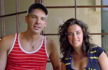
Fogo Creative’s Margot Durling and Jody Burry are birds of a feather. The Halifax design duo create city maps, redesign playgrounds and craft program guides for events such as the inaugural Out East Queer Film Festival.
Together, Fogo Creative combines whimsy, clean lines, colour and an infectious sense of play.
“Design solves problems. Look around you; design is everywhere,” Durling says. “Apart from nature, which often inspires design through bio-mimicry, everything around is thoughtfully designed through a process of research and exploration. The form, colour and function, it’s all intentional.”
After meeting as students at Nova Scotia’s College of Art and Design, Burry and Durling combined their entrepreneurial spirit to build Fogo Creative.
“We wanted the freedom and independence of choosing projects that were meaningful to us,” Durling says. “The challenges of owning your own business outweighed the appeal of working for any agency.
“There’s something very satisfying about being your own boss and 100 percent responsible for your own livelihood. At times it can feel like a carnal existence driven by survival.”
Nestled in Creative Crossings, in the heart of Halifax’s north end, Fogo Creative is a bright space with 20-foot ceilings. Burry and Durling are most at home with their two dogs, Stewart and Norton, at their feet.
Fogo Creative’s design philosophy is simple: less is more.
“Expressive typography, semiotics, empathy, research,” Burry says. “Always function before form, but play with form and go wild.”
The duo notes that Halifax, with its diverse and eclectic culture, informs their design aesthetic, their business sense and how they live their lives.
“The community here is bound together through thick and thin. Most of our work comes through word of mouth,” Durling says. “We do quality work and build relationships to last. There is a warmth, friendliness and sense of family in the Maritimes. The bigger, faster, stronger mentality doesn’t exist. Quality and authenticity is valued.”
Durling is inspired by old machines, letterpress and screen-printing; it’s life’s simple pleasures – music, food, culture, travel, humour, dancing and love – that fuel her creativity. But Burry says he is more hands-on, fascinated by cutting, pasting, layering and building.
Durling is from Halifax, but Burry draws upon his Newfoundland roots, a place built on contrasts: “it’s dark and colourful, mysterious and familiar, naive and complex.”
Both designers agree: their queer identity is integral to their work.
“We are resilient,” Durling says. “We recognize that there are still triumphs to be made in our world to bring a voice to important organizations and individuals. Much of our clientele are LGBTQ or queer allies.”
Over the years, Fogo Creative has worked with Halifax Pride, WetSpot and The Company House, all local queer-owned and operated events and businesses.
“It allows us to see the world through a different lens,” Burry says. “I believe this makes us more conscious of our surroundings and also very sensitive to how we create for others.
“We believe the arts are filled with tremendously passionate, creative and artistic LGBTQ people. We strive to surround ourselves and work for individuals who share the same passions.”
Check out Fogo Creative at fogocreative.com.
 Why you can trust Xtra