Things look a whole lot different on Xtra today: a fresh design, a new font, an expanded colour palette, an updated logo and even a different url. What you are gazing upon right now is the result of nearly two years of very hard work and very long hours, lots of creativity (and the occasional creative difference) as well as an abundance of love.
If that sounds corny, so be it. Xtra, which launched in Toronto in 1984 as a local, free, lesbian and gay newspaper, has always been a labour of love. We were founded as—and proudly remain—an independent, mission-driven, community publication. And while that foundation has not changed, Xtra has evolved. Five years ago, we ceased our print editions and became a digital-only publication. Since then, we have embraced a more global perspective on LGBTQ2S+ politics, culture, sex, relationships and health, and have strived to be more inclusive and representative of our communities—in our coverage, subjects, contributors and staff.
That evolution is evident in every element of our redesign. In early 2019, we asked Studio Wyse, an award-winning and globally recognized editorial design shop, to help us with our makeover. We wanted to honour our 30-plus-year legacy and our longstanding readers, while making Xtra fresher, sharper, more dynamic and relevant to a growing audience. And we wanted the look and architecture of our site to embody our values and principles.
Our goal was to build a space that was beautiful and welcoming, where the best LGBTQ2S+ storytelling could shine, where people could find essential information and news, see themselves and their communities reflected, and feel connected to one another. You see, we don’t think of Xtra as simply an online magazine, but rather as a commons for queer folks of all identities and backgrounds. And over the past year, as pandemic lockdowns have shuttered LGBTQ2S+ bookstores, bars and community centres and cancelled Prides and other events, our need to come together feels greater than ever.
With that in mind, let me take you on a tour of our new site.
Same name… The very first Xtra’s were local Toronto event and bar guides tucked into our now defunct predecessor, The Body Politic—a little something extra, with the “e” dropped to be cheeky. We briefly considered a title change, but our team loved that our historical name nodded to the current queer meaning of “extra,” as in being altogether a bit too much. Because isn’t being “a bit too much” our community’s superpower? We are the flamboyant butches, dandies and femmes and the overwrought divas and drama queens. We are the hips that unmistakably swish, the voices that rise above the crowd, the fast walk, the hefty ring of keys, and the bodies that insist on claiming space and turning everyday sidewalks into runways.
…new url. To indicate our shift from newsier reporting to longform writing, analysis and mini documentaries, we’ve dropped the “daily” from “dailyxtra” and added “magazine.” Don’t worry: all our archives continue to live on. Our phenomenal tech team and website developers not only built an accessible, fast and user-friendly site, but also painstakingly migrated tens of thousands of items from our old sites, to gather decades of our work onto a singular new platform.
New look, new font and new palette. Studio Wyse took us down dozens of wonderful rabbit holes in their research—including a fascinating discussion about whether fonts have genders—and dug deeply into our activist, DIY past for design inspiration. They made mood boards of the covers of back issues of The Body Politic and Xtra, pictures of our old hot pink newspaper boxes, 1980s AIDS activism posters and 1990s queer zines. They introduced us to the work of some fabulous LGBTQ2S+ photographers and illustrators, with an emphasis on the work of racialized artists, to support our vision of showcasing more images of members of our communities throughout our site. The resulting look is modern, elegant and easy to navigate, but with lots of playful elements and surprises.
For our primary colour palette, we deepened our signature pink to make it more vivid, and selected complementary and contrasting shades to signify each area of editorial focus: blue for Power, teal for Health, blush pink for Love & Sex and purple for Culture (and a hit of yellow throughout to make everything pop). These shades include some of the stripes of the original rainbow flag, as well as the colours in flags representing other identities in our communities (trans, bisexual, nonbinary, pansexual, leather, to name a few).
Our font is Sharp Grotesk Xtra, a slightly customized version of Sharp Grotesk. The Sharp family of typefaces were created for the digital world and has infinite variations—Grotesk looks cute, but can be serious, too (kind of like us, in fact). What sold us was the flirty smile in the lower case “a” and the friendliness of the “x.”
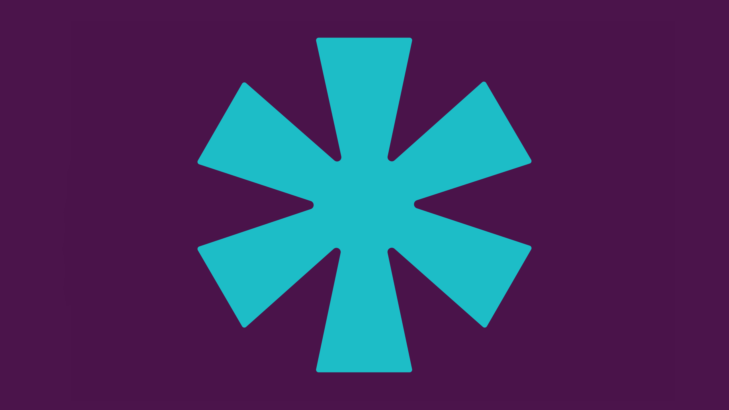
Of course, we didn’t forget the sparkle. Finally, at the core of Xtra’s new look is the asterisk, which both stands alone and punctuates the end of our name, as an exclamation point once did in an earlier iteration of our logo. Traditionally the asterisk signifies an omission, a footnote, or an afterthought—information deemed not important enough for prime real estate, but rather relegated to the bottom of a page. The asterisk sanitizes curse words and softens the blow of slurs—yet sometimes, though, the symbol is deployed to censor proudly reclaimed identities such as g*y or qu**r, equating them with profanities.
As much as the symbol has been used to obscure, we believe the asterisk holds real power. It tells us there is more to say, more to learn, more to do. So across every page of xtramagazine.com you’ll see an asterisk glittering right at the top. And like members of our communities, our asterisks come in bountiful variations and forms. The symbol is our promise that LGBTQ2S+ people will never be an omission, footnote or afterthought here. Your stories are, and will always be, our stories, too.
Let us know what you think. We believe we’ve built something truly special. And this is just the beginning. Over the next few months, we’ll continue to tinker. There will be some bugs to fix and there are still many fun new features to add to our video and article pages—including functions that will allow you to engage more fully with us and each other. Each step of the way, we’ll keep you informed on our ongoing transformation and I hope you’ll tell us what you think of our makeover. There are plenty of ways to stay in touch. You can subscribe to our newsletter Xtra Weekly. You can follow us on Twitter, Facebook, YouTube and Instagram. And you can email us at inside@xtramagazine.com. Now, please, go ahead and make yourself at home.

 Why you can trust Xtra